Want lettering that looks like it came off a fancy greeting card, using a marker you already own? These brush lettering tutorials walk you from your very first thin upstroke to bouncy words, rainbow blends and chalkboard signs that make guests ask who you hired. Brush lettering for beginners is mostly one trick: press down, ease up, repeat until your hand remembers. The lessons below break that into drills, letters and finished pieces, with free practice sheets, pen guides and a few iPad options for hand lettering in Procreate. Grab a cheap pen and a stack of printer paper and give one a try tonight! Perfect for bullet journals, handmade cards, party signs, gift tags and anyone who wants a relaxing new hobby.
1. Create Colorful Rainbow Brush Lettering
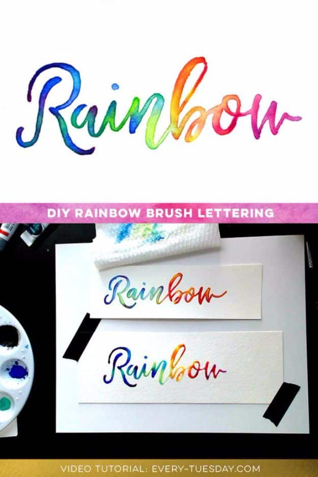
Rainbow lettering looks like it took a hundred careful color swaps, and that’s the fun secret here: it doesn’t. This video lesson shows two ways to get a full gradient into a single word without endless re-dipping, one gentle method to ease you in and one that lets every color melt together. Pan watercolors, a round brush and watercolor paper are all you need. The blending happens on the paper while it’s still wet, so the colors flow into each other on their own. Try it on a name, a quote or the front of a birthday card and watch people assume it’s printed.
Get the full tutorial at Every Tuesday.
2. Free Brush Lettering Practice Sheets
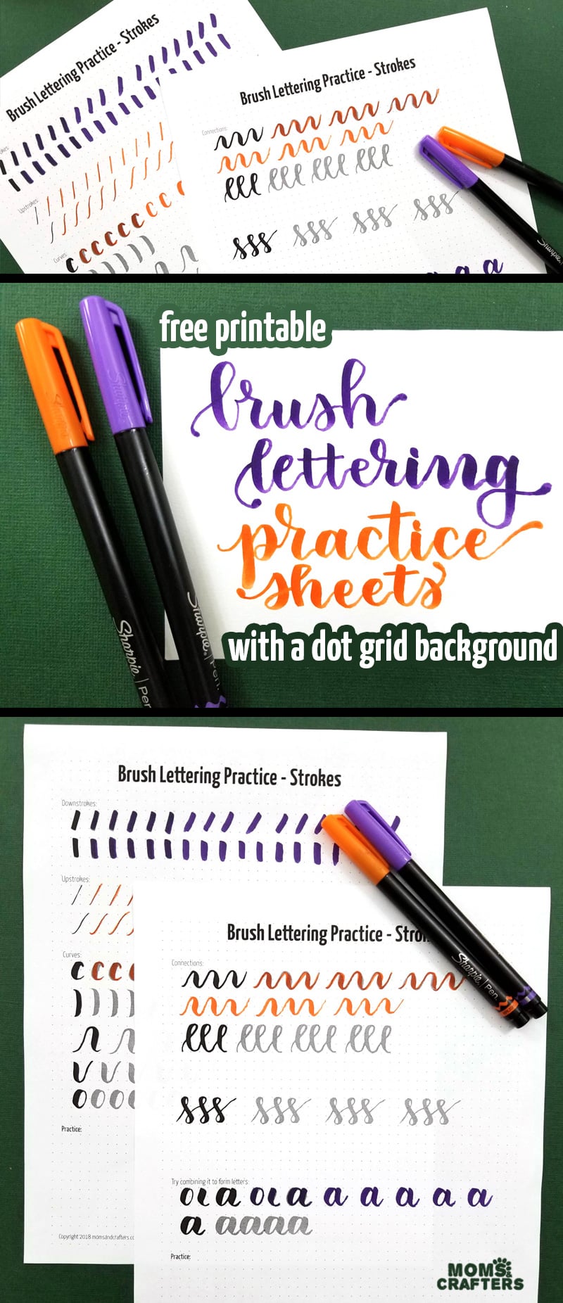
Every pretty brush script starts with boring little strokes, and these free printable practice sheets make the boring part almost relaxing. The pages cover the basic shapes, from thin upstrokes and thick downstrokes to ovals and compound curves, then nudge you into combining them. They sit on a dot grid instead of lines, so you get a gentle guide while learning to letter without a ruler holding your hand. Print as many copies as you like and fill them with a medium brush marker. Once these feel easy, actual letters come together much faster than you’d expect.
Get the full tutorial at Moms and Crafters.
3. Hand Lettering the Alphabet A to Z
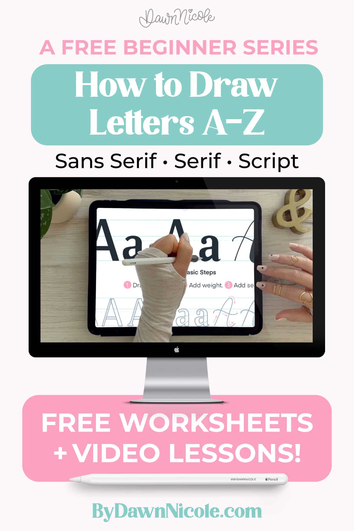
If you’ve ever stared at a blank page wondering which letter to even start with, this free series answers that one letter at a time. Each letter from A to Z gets its own video lesson and free worksheet, showing a basic sans serif, a serif and a script version. It’s taught in Procreate on an iPad, but the downloads include a printable PDF, so paper and pen work just as well. Follow it in order or jump to the letters that give you trouble. By Z you’ll have a complete hand lettering alphabet ready for cards, signs and journals.
Get the full tutorial at Dawn Nicole.
4. Looping Letters
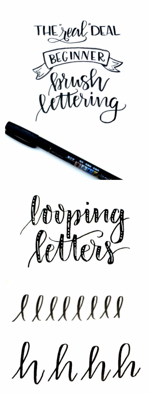
Loops are where brush lettering for beginners starts to feel like real calligraphy, and this lesson builds them from pieces you already know. You start with a thin upstroke, cross back over it with a thick downstroke to form an l, then add a squiggle to make h, b and k. The final loop letter flips the order and ends with the loop instead. The advice is wonderfully blunt: fill a page or two with each one. Play with big open loops and small tight ones until you find the size that feels like your style.
Get the full tutorial at Amy Latta Creations.
5. Brush Lettering Basics From Scratch
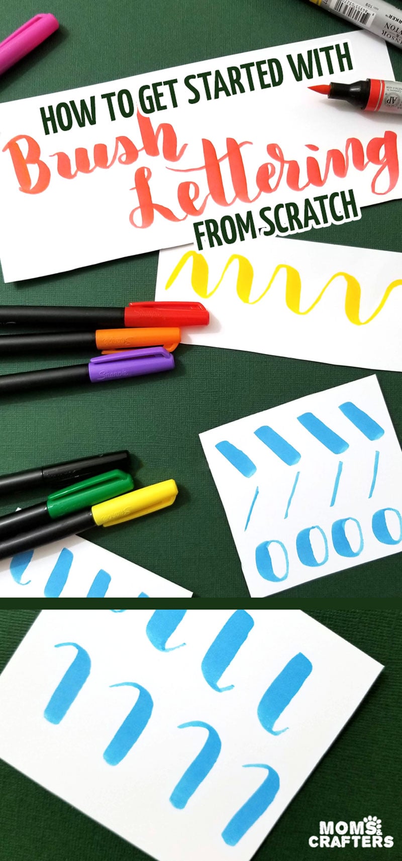
Starting completely from zero? This one covers the three basics that matter most before you buy a single fancy pen. First, the grip: hold the brush pen at about a 45 degree angle and move your whole hand rather than just your fingers. Second, thin up and thick down, the one rule behind every pretty script you’ve admired. Third, draw each letter as its own shape instead of writing in your normal handwriting, then connect them. It’s honest about wrist strain too, which is helpful if long sessions leave you sore.
Get the full tutorial at Moms and Crafters.
6. Basic Bounce Lettering
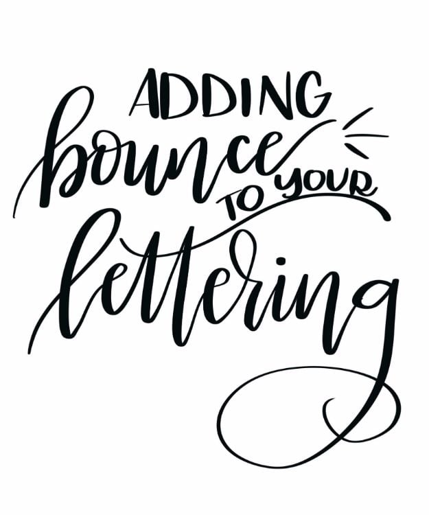
That playful, bouncy lettering all over Pinterest has a secret, and it’s breaking the rules you learned in grade school. This tutorial starts by explaining the guidelines every letter usually follows, from the baseline and x-height to the ascender and descender lines. Then it shows you how to let ascenders climb higher, let descenders drop lower and stop keeping a straight baseline. The best part is the help with making that look intentional instead of messy, since just writing anywhere tends to look wobbly. Practice one word over and over and the bounce starts to feel natural.
Get the full tutorial at Amy Latta Creations.
7. The Best Brush Pens for Beginners
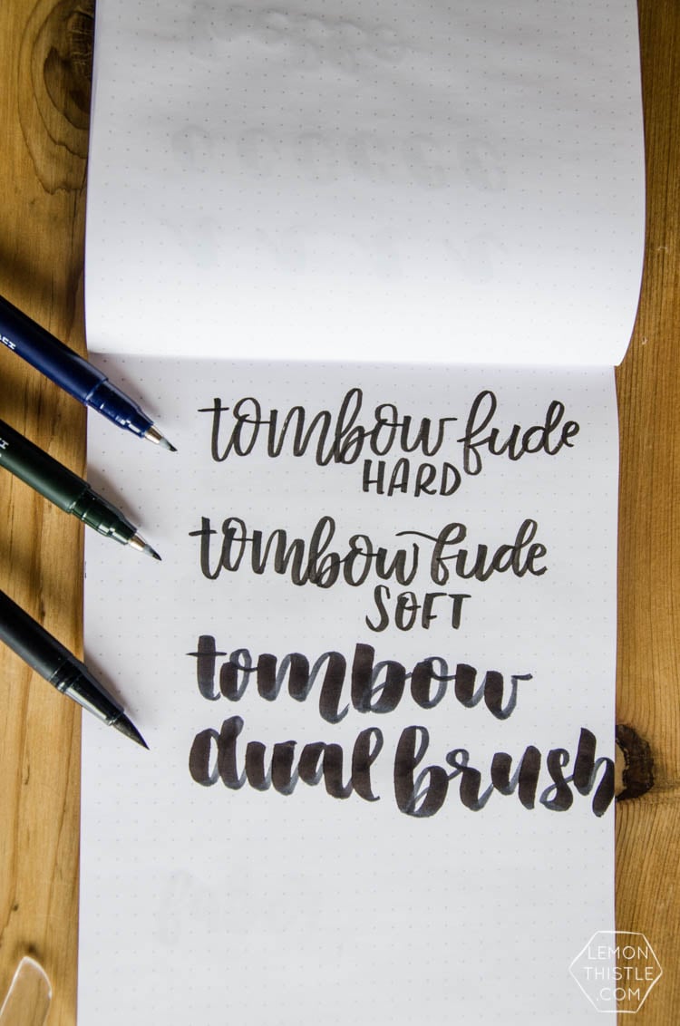
Not sure which pen to buy? This guide compares favorite brush pens side by side, and it’s refreshingly specific about what each one does well. The Tombow Dual Brush Pen has a big, soft felt tip with gorgeous thick and thin variation but can fray on rough paper, so stick to smooth sheets. The tiny Tombow Fude is great for cards, envelopes and place cards, and the hard version is easier for beginners to control on thin upstrokes. Read it before you shop and you’ll skip buying a pile of pens you end up hating.
Get the full tutorial at Lemon Thistle.
8. Brush Lettering DIY
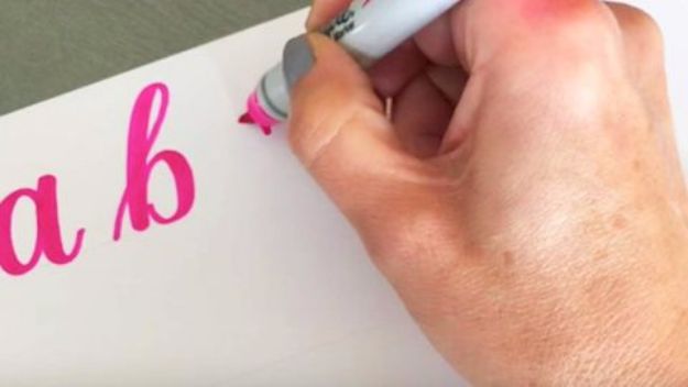
Think brush lettering takes years of practice? This one shows how far you can get with a brush marker, paper and about an hour. The video walks you through the most basic way to get that brush lettered look, step by step, starting with simple strokes and building up to full letters. It’s a great fit if you’ve been wanting lettering for cards, chalkboard art or canvases and just need someone to show you the motion. Watch it once, then letter along with it. No two people’s results look the same, and that’s exactly what makes it art.
Get the full tutorial at DIY JOY.
9. Blending Tombow Markers
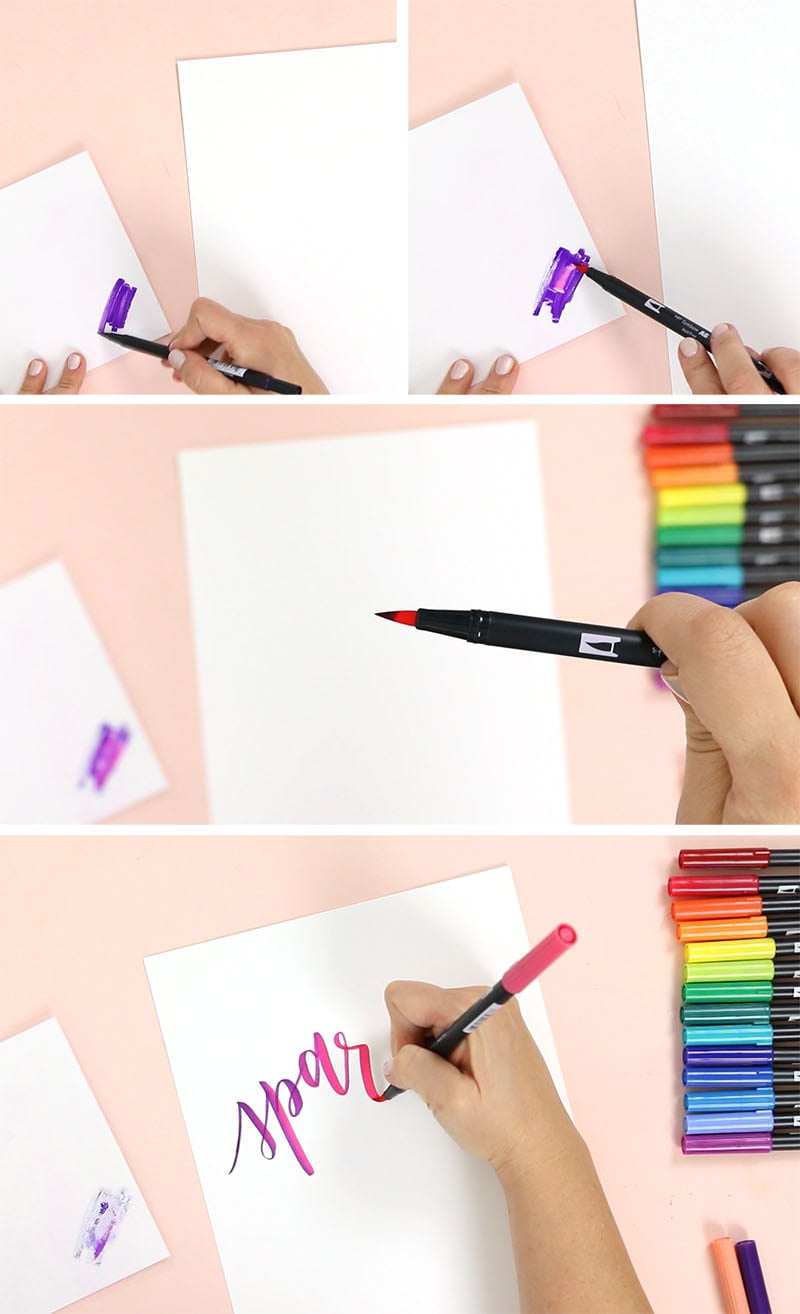
Ombre lettering is one of those effects that looks hard and turns out to be a little bit magic. The trick is a blending palette, which is just a smooth non-porous surface you scribble one color onto, then pick up with a second pen so the tip carries both shades. Tombow Dual Brush Pens are water-based, so the colors fade into each other beautifully as you write. Use ultra smooth cardstock to protect the tips, and add a white gel pen for highlights if you like. There’s a video too, plus free printables if you want the finished designs.
Get the full tutorial at Persia Lou.
10. Crayola Markers Modern Brush Lettering

Before you spend a dime on brush pens, raid the kids’ craft bin. This tutorial shows how plain Crayola markers can make surprisingly lovely modern calligraphy. Hold the marker at a 45 degree angle so the tip makes thin lines and the side of the cone makes thick ones. The honest catch is pressure: you have to push hard on downstrokes, and the cone tips will wear out faster than they were designed to. That trade is worth it for a cheap way to learn the motion. There’s a video showing the exact angle in action.
Get the full tutorial at Little Coffee Fox.
11. Mix and Match Letters

Once single words feel comfortable, this mixed style is pure fun. You combine script and print letters in the same word, so lettering looks hand drawn rather than like a font. A few guidelines keep it balanced: keep most letters about the same size with vowels smaller, write repeat letters in a different style each time, and use roughly equal script and print letters. Sketch the words in pencil first and start with the middle line when you have several. The goal is letters that nestle together like puzzle pieces, and it works beautifully on posters and prints.
Get the full tutorial at Tombow USA.
12. Long Shadow Lettering
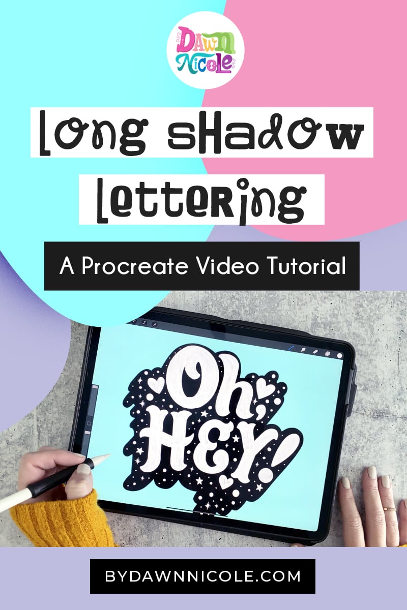
Want lettering that pops right off the page? Long shadows are a quick way to add drama, and this free Procreate video shows how in under ten minutes. You letter a word, then build a deep shadow stretching out behind it so the whole piece looks bold and dimensional. A few optional extras like a textured crayon brush and stamps are mentioned, but you can follow along without them. It’s a great one to try after you’ve got a few letter styles down. The same shadow idea works with markers on paper if you don’t have an iPad.
Get the full tutorial at Dawn Nicole.
13. Hold Your Pen at an Angle

If your strokes all come out the same thickness, the culprit is probably how you’re holding the pen. This lesson is all about angle: a brush pen held upright can’t flex, so you never get those thick downstrokes. Tilt it, keep that angle steady as you write and let the side of the tip do the work. Barely touch the paper on the way up and press on the way down, with a handy chant to remember it: thin up, thick down. A video shows the difference between upright and angled side by side, which makes it click.
Get the full tutorial at Pieces Calligraphy.
14. Using a Water Brush for Lettering

Water brush lettering is looser and dreamier than marker work, and it’s perfect for anyone who loves a little color. A water brush holds water in the barrel, so there’s no cup to spill and it travels anywhere. Spritz a cheap pan watercolor set first so the paint turns creamy, then letter without squeezing the barrel, which keeps the paper from flooding. Weight the downstrokes and lighten the upstrokes just like with a brush pen. Expect whimsical, a bit imperfect strokes rather than crisp hairlines, which is the charm. Practice on printer paper first.
Get the full tutorial at CreativLEI.
15. Hand Lettering in Procreate
Thinking about lettering on an iPad? This guide is a friendly overview of why so many letterers love Procreate and how to get started. Pressure-sensitive brushes give you real thick and thin strokes, layers make edits painless, and guides and grids keep letters consistent. The biggest perk for beginners is the undo button, plus unlimited digital paper and worksheets you can trace. It also covers what you actually need, and the reassuring news is that the built-in brushes are plenty to begin. If wasted paper and smudged ink have you frustrated, this might be your new favorite way to practice.
Get the full tutorial at Dawn Nicole.
16. Chalkboard Lettering
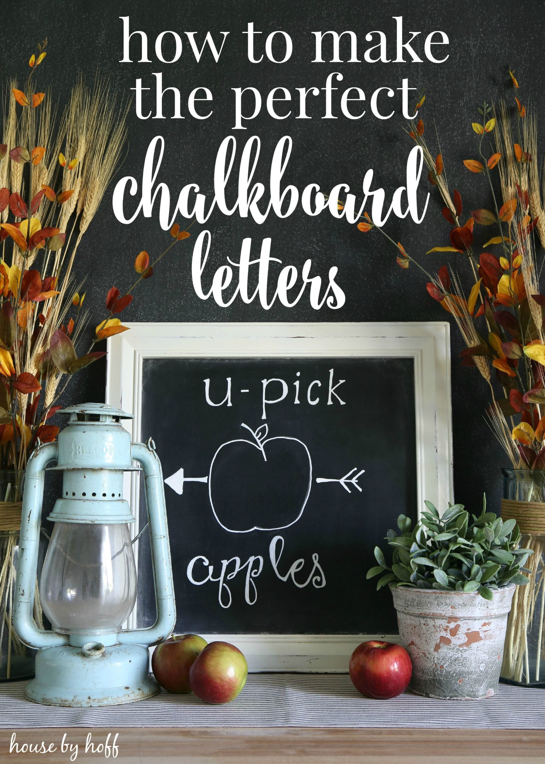
Chalkboard signs are the classic use for hand lettering, and this tutorial covers the steps that make them look polished. Start by seasoning the board, rubbing chalk sideways over the whole surface and wiping it off, so erased mistakes don’t leave ghost marks. Sketch your design in plain chalk first, since that’s the stage for fixing spacing and centering. Then go over it with a chalk marker to thicken lines and add detail. Mocking up the sign digitally first helps you see the spacing. If the marker won’t come off later, a magic eraser does the trick.
Get the full tutorial at House by Hoff.
17. Applying Pressure in Brush Calligraphy

Pressure is the whole game in brush calligraphy, and this lesson explains it clearly enough to finally make sense. More pressure gives a thicker stroke, less gives a thinner one, so you press on downstrokes and lighten up on upstrokes. Every brush pen flexes a little differently, so spend time getting to know yours before judging your writing. Holding the pen at an angle also saves the tip from fraying. There’s even a note for lefties: an overwriter grip lets you reach the same angle. It’s a short read that fixes a lot of frustration.
Get the full tutorial at Tombow USA.
18. Brush Lettering Tips and Practice

Here’s a handful of small tips that make a big difference, each with a short video. Press down for thick strokes and hold the pen more upright for the thinnest upstrokes, writing those a touch faster to avoid shakiness. Write each letter separately rather than dragging the pen through a whole word, which keeps lettering from looking cramped. Don’t skip the little connecting flicks that join one letter to the next. Pencil guidelines for the x-height, baseline and cap height keep a piece centered, and stretching downstrokes into the descender space gives a modern look.
Get the full tutorial at Surely Simple.
19. Watercolor Calligraphy

Watercolor calligraphy takes the brush lettering you already know and adds glowing color. This guide starts with materials, which really matter here: good watercolor paper, a water brush pen for easy control, and either budget paints or richer liquid watercolors that blend beautifully. Black cardstock with metallic gold paint makes a stunning combination. Holding a soft brush is very different from a flexible marker tip, so the technique section is worth a careful read. It assumes you know basic brush lettering, so save it for once your thick and thin strokes feel steady.
Get the full tutorial at Little Coffee Fox.
20. Easy Flourishes
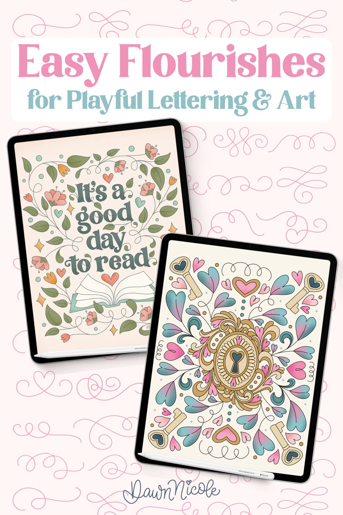
Flourishes are those little swirls, curls and loops that make plain lettering look finished, and they’re easier than they seem. This tutorial explains what flourishes are, why they add so much personality, and how to keep them from overwhelming your words. Sketch them first, start with symmetry, use them to fill awkward empty space and keep the word readable. One tip is to sleep on it and look again fresh. The ideas work in Procreate or with a pen on paper, and there’s a free color palette download too. A few curves can turn a simple word into art.
Get the full tutorial at Dawn Nicole.
21. DIY Hand Lettering

No brush pen? No problem. This classic tutorial treats hand lettering as drawing letters, which makes it doable with a pencil, an eraser and a few fine black markers. You’ll make a little Happy Days card to tuck into a bunch of flowers. Start with faint guidelines for the baseline, x-height, cap height and an angled slant line, then sketch the letters loosely before inking. Textured paper like watercolor stock gives the finished card a lovely handmade feel. Once you get the hang of it, labels, cards and gift tags all start getting a lettered upgrade.
Get the full tutorial at Geneva Vanderzeil.
22. Beginner's Guide to Brush Lettering

This beginner’s guide is a solid place to learn how a brush pen actually works. It looks like a marker, but the cone-shaped nib flexes like a paintbrush, giving hairline upstrokes and big, bold downstrokes. You’ll learn how to hold the pen close to the nib for control and how your angle shifts as you write. Tombow Dual Brush Pens are the main tool, but the lessons apply to any brush pen and carry over to watercolor too. Stick around for the bonus video on blending, then head to part two when you’re ready.
Get the full tutorial at Destination Decoration.
23. First Step in Brush Lettering

Here’s the good news: the first step in brush lettering doesn’t need fancy supplies at all. Grab a regular Crayola marker and just practice straight lines, thick on the way down and thin on the way up. For thick lines, tilt the marker so the side of the tip lies flat and press. For thin ones, ease off and hold it more like you normally would. That’s it, and the tutorial encourages you to stay on this step until it feels natural before moving on. It’s a great confidence builder if fancy pens have been intimidating you.
Get the full tutorial at Lyss Tyler Letters.
24. Make Amazing Hand Lettering Art

These five tips are for anyone who loves the look of hand lettered quotes but swears they aren’t artistic. Hand lettering builds on your own handwriting, so it’s more learnable than it seems. Graph paper keeps letters straight if they tend to wander, and there’s a free download so you can print your own lighter grid. Erasable FriXion pens are the star tip, letting you skip the pencil sketch and ink stage altogether. The rest of the tips help you plan a quote into a finished piece of art worth framing or turning into a printable.
Get the full tutorial at Printable Crush.
25. Practicing Thin and Thick Strokes

Smooth transitions between thin and thick are what make brush calligraphy look effortless, and this lesson builds them step by step. Start with a three-part drill on every new pen: a hairline stroke with barely any pressure, a medium stroke, then full pressure. It shows you exactly what that pen can do. Next, focus on consistency over perfection, moving from single strokes to connected ones. Finally, study each letter as a set of strokes and notice where it shifts from thick to thin. A slow breakdown of the letter a ties it all together nicely.
Get the full tutorial at Pieces Calligraphy.
26. Embossed Lettering in Procreate
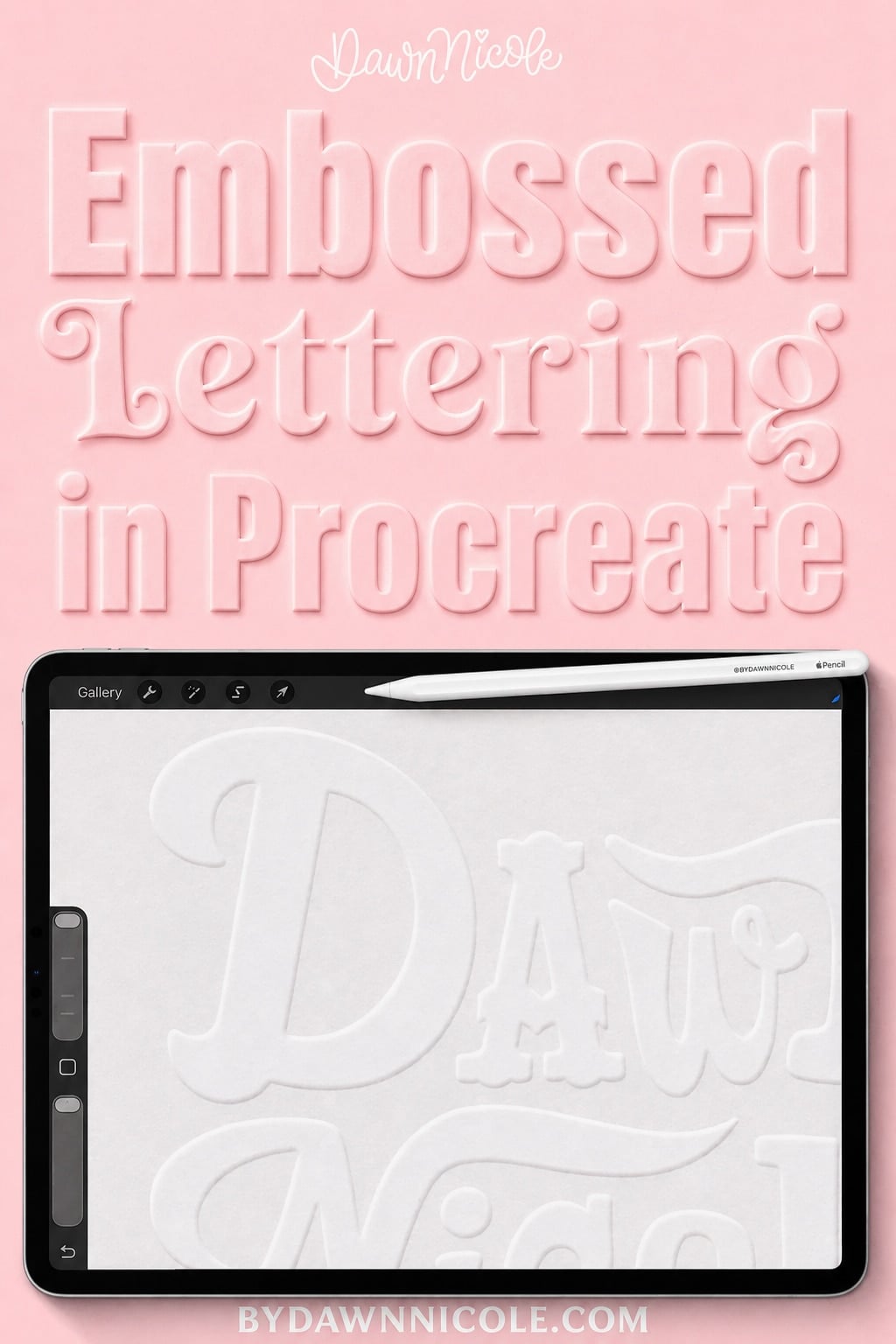
Embossed lettering looks pressed right into paper, and this tutorial shows how to fake that effect in Procreate. Using layers, blend modes, highlights and shadows along the letter edges, you can make words look raised like fancy stationery or a wax seal. Screenshots walk you through every step, starting with a muted, paper-like background color for the most realistic result. No special brushes or advanced techniques are needed. Once you get it, the same method works for subtle pressed-paper looks or bold dimensional designs. It’s a fun upgrade for lettering you want to print or share.
Get the full tutorial at Dawn Nicole.
27. Modern Brush Lettering Tips for Beginners

Real-brush lettering is the most painterly kind, loose and a little messy in the best way. This guide uses a #6 pointed round brush with India ink or watercolor, and it’s practical about the mess: protect your table and start with only a little ink in the palette. Warm up by filling a sheet or two with vertical, diagonal and curved strokes, varying pressure as you go. Practice on cardstock because it’s cheaper, and save watercolor paper or Bristol board for finished pieces. Then it’s on to the alphabet, which feels like grade school in the nicest way.
Get the full tutorial at Oh So Beautiful Paper.