Get ready to have your mind blown! After seeing this you’ll never see these logos the same way again.
Things aren’t always what they seem at first glance, and these logos prove it. Check out these famous logos that you may not have realized actually have a hidden double meaning.
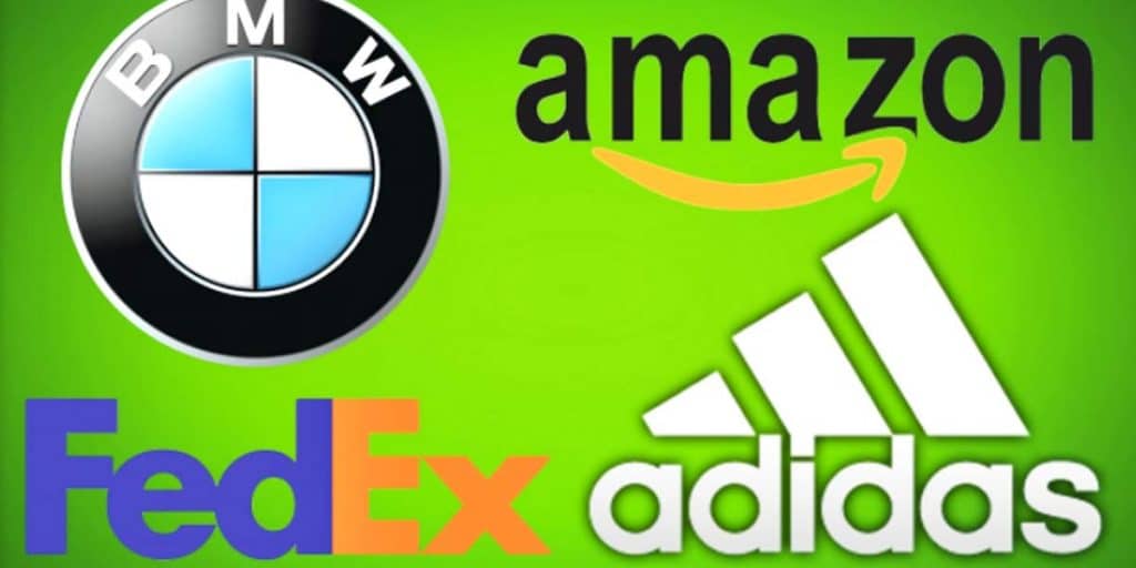
The shipping company’s logo is probably one of the best-known in the world of “hidden image” logos. For those who are unaware, take a look between the “E” and the “X,” where the negative space forms an arrow. In an interview with Fast Company, the logo’s designer, Lindon Leader, said, “The arrow could connote forward direction, speed and precision, and if it remained hidden, there might be an element of surprise, that aha moment.”
Baskin-Robbins, is the world’s largest chain of ice cream specialty shops, best known for its 31 flavors. The company’s pink and blue logo depicts a large “BR” that doubles as the number “31.”
The logo for tortilla chips and dips manufacturer Tostitos, is a prime example of “once you’ve seen it, you can’t un-see it.” Initially, the logo appears to be the Tostitos name in front of a vibrantly colored background. However, the two “T’s” of this logo make up people, as they dip a tortilla chip into the bowl of salsa on top of the letter ‘I’.
Famous for their chocolate and appropriately themed amusement park, Hersheypark, the logo on The Hershey’s Kisses product has a hidden logo: an extra Kiss. Turn your head to the left and you’ll see that between the ‘K’ and the ‘I’ there is a Hershey’s Kiss baked into the logo.
Check out the video for more interesting hidden messages in logos we see every day!


